Where Content meets Design systems
The context:
I joined Contentsquare’s Design Systems team as the first Content Designer, with a focus on laying the foundations for how content design best practices could be embedded into both new and existing components.
At the same time, I kicked off an initiative to unify and simplify various content resources. The goal was to create a single, reliable repository that would better support the day-to-day needs of our Product and Design teams.
The team:
Design lead, Product designers, Content designer (me).
Phase 1: Components
The challenge
When I joined the team, Contentsquare had recently acquired two other companies—Hotjar and Heap. Each came with its own Design System. As the teams merged, it became clear we needed one centralized system to ensure consistency across all the different products and features the teams were building.
For me, this also came with a personal challenge: I was new to Design Systems and had a lot to learn about how components are built, and where content design fits in. Instead of limiting my role to proofreading or simplifying documentation, I wanted to make sure content was embedded from the start, helping shape components that reflect UI, UX, and content best practices.


Content requirements for a Sheet component
Creating documentation
Some of the first components I worked on were modal, panel, and sheets. Because these are content-heavy, they were the ideal starting point.
I collaborated closely with a Product Designer, who helped me quickly get up to speed on Design System fundamentals. Together, we first defined the anatomy of each component, taking into consideration platform requirements, and the needs of the wider design team.
From there, I focused on the documentation itself. I rewrote existing DOs and DON’Ts to make them clearer and easier to follow, while also adding content-led best practices. We broke down each component into key elements such as title, subtitle, call to action, and outlined common use cases like error states, destructive tasks, and confirmations.
To make the documentation more actionable, I also introduced a Content requirements section. This went deeper into areas like writing effective calls to action (in case a see-and-grab wasn’t available), structuring content hierarchy, and ensuring copy worked seamlessly within the component’s design.
Getting feedback
One of the most valuable insights we got from the Design team was that they found it much more useful to see examples from our own platform within the documentation, rather than examples from external products. This made sense since what “good” looks like is highly contextual. To support this, we spent time going through all three platforms to identify examples of what we shouldn’t do, then reworked them into best-practice versions. That way, designers could simply take the component as is, knowing the design and content were already in line with standards.
We made sure to get plenty of feedback on the components documentation as we we went along. We did this via refining sessions with the Engineering team, as well as show-and-tell with the Design team. These check-ins were invaluable for making sure the documentation served everyone’s needs and stayed practical.
Snippet from the Modal component documentation
Because there were three Product designers working on the Design System team, and only one Content designer (me), I decided to prioritize components where content played a critical role, such as breadcrumb, input, search, and more.
To make progress and status visible at a glance, I suggested we visually mark where each component stood in the process. One of the designers built this out as a checklist (images below), which became a simple but effective way to show what was complete, and what was still a work in progress.
These steps not only made the documentation more practical and usable, but also helped increase adoption of the Design System across teams. For me, it reinforced the value of bringing content design into the process early, when language, structure, and clarity can shape components as much as visual design does.
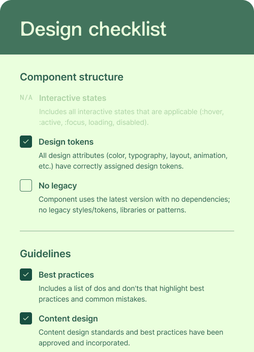
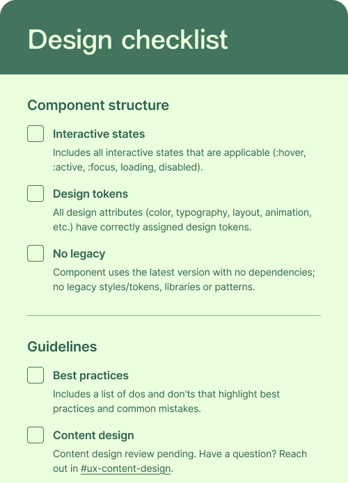
Part of the Design checklist created to help us track the status of eah component
Phase 2: Content guidelines
It wasn’t just our Design System that needed unifying. Across the three companies, multiple teams had created their own content best-practice resources, scattered in different places, and hard to find. For teams without a dedicated Content designer, this lack of visibility made it difficult to get the guidance they needed.
Surveying the primary user
To explore this further, I ran a survey with Product designers and a few Product managers. The aim was to understand:
How they currently get content support
Which resources they find most helpful
What would be most useful going forward.
The results were telling: nearly 60% weren’t aware of any existing resources, relying instead on ad hoc support from the Content design team, something that overwhelmed us and slowed delivery. There was a clear need for centralized, easy-to-access guidance.
As part of the survey, I also wanted to learn what type of guidelines would be most useful (e.g. specific to product areas, grammar and spelling, voice and tone, etc.) and where would be the best place for those to live (Design System, Confluence, elsewhere).
The feedback gave us exactly the insights we needed. My manager and I used it to define concrete next steps and a clear plan of action.

Some of the next steps defined based on the survey insights
The result:
I audited all the content resources created across the three companies and consolidated them into a single, centralized space within the Design System where everyone could access them.
Although I didn’t finish the project as it coincided with my decision to leave the company, this work laid the foundations for the rest of the wonderful Content design team to carry it forward.
On the Design Systems side, we created a documentation template that embedded Content design best practices from the start. This not only helped ensure consistency but also made designers’ day-to-day work easier and more efficient.
This project reinforced how foundational content is to a Design System, and gave me the opportunity to define that role from the ground up which was a true priviledge.