Advanced dashboards at Hotjar
The context:
Dashboards in Hotjar give customers a single place to track the metrics that matter most to them. However, not all Hotjar customers are data-savvy, so creating and interpreting a dashboard needed to feel much more simple and intuitive.
I was the Content designer in the team responsible for advancing Hotjar’s analytics and filtering capabilities. Our mission was to improve adoption by making Dashboards easier for everyone to create and use.
The team:
Product manager, Product designer, Content designer (me).
Phase 1: Widget templates
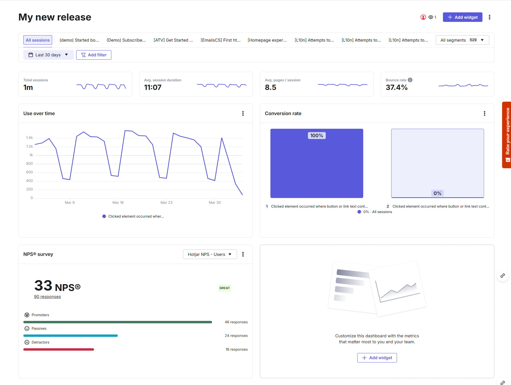
Widgets allow users to quickly add metrics to their dashboard.
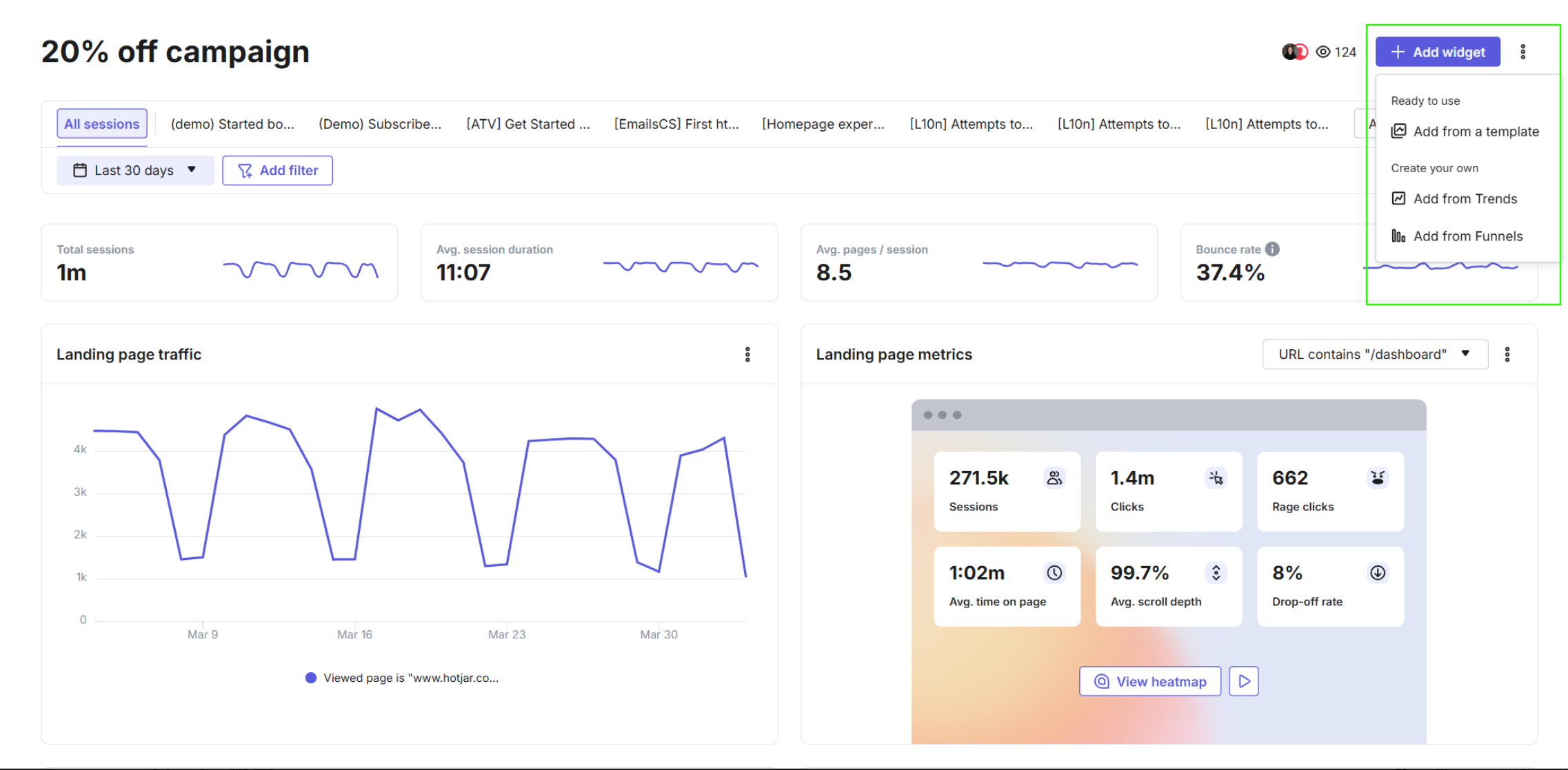

A dashboard populated with various widgets
Shaping the terminology
The first step in simplifying dashboard creation was building a library of widget templates that users could easily add to their dashboards. This aligned with the discovery work and competitor research the team had already carried out.
We introduced a clear entry point at the top of every dashboard, making the templates easy to discover. The main call to action (see image on the left) offered two options:
Add a ready-to-use template
Create a custom widget from a Funnel or Trend the customer had already built.
A big part of my role here was shaping the terminology: what to call the dropdown options, and how to name the modal that contained all available widgets. Below you can see some of the naming directions we explored during a brainstorming session with the team.

Exploring naming options for the widget dropdown
As part of the user interviews we ran to validate the flow, we tested the two terms we thought worked best: ‘‘widget gallery’’ and ‘‘widget templates’’. While the team initially leaned toward ‘‘gallery’’, testing showed that users strongly preferred ‘‘templates’’. It matched their mental model and felt more intuitive, so we followed the users’ lead.
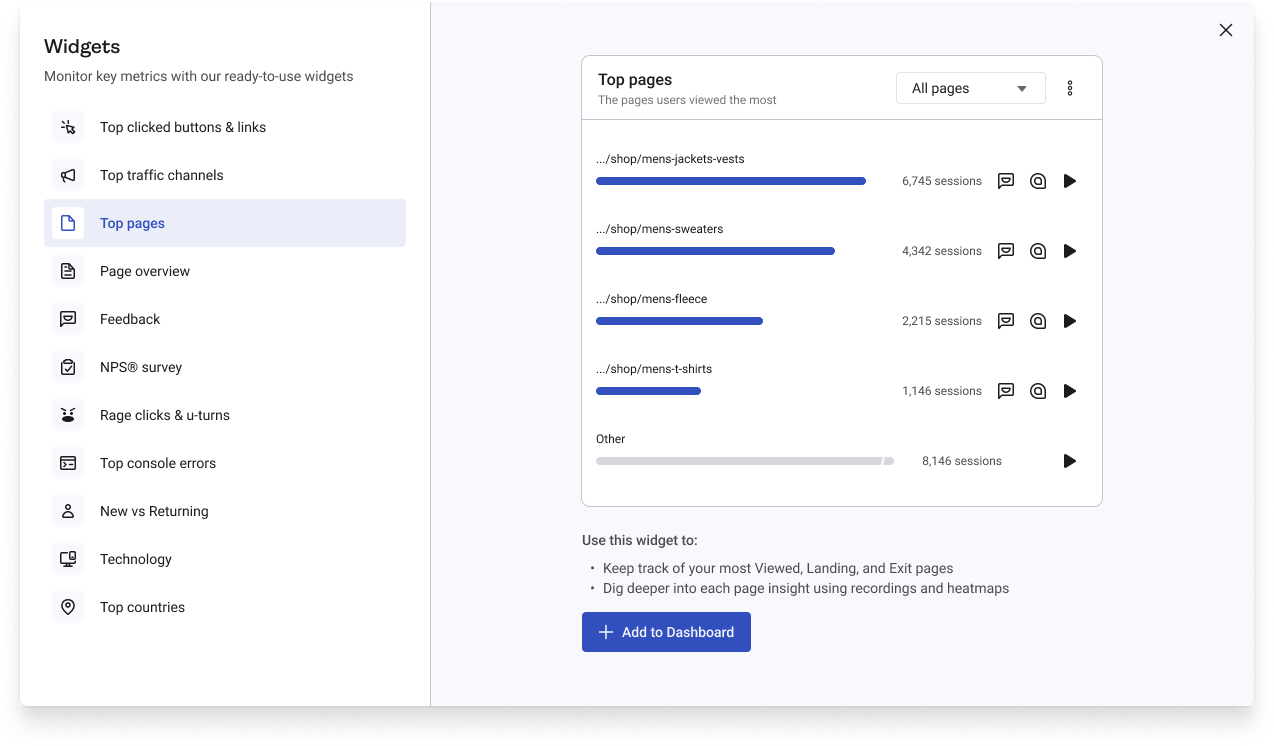
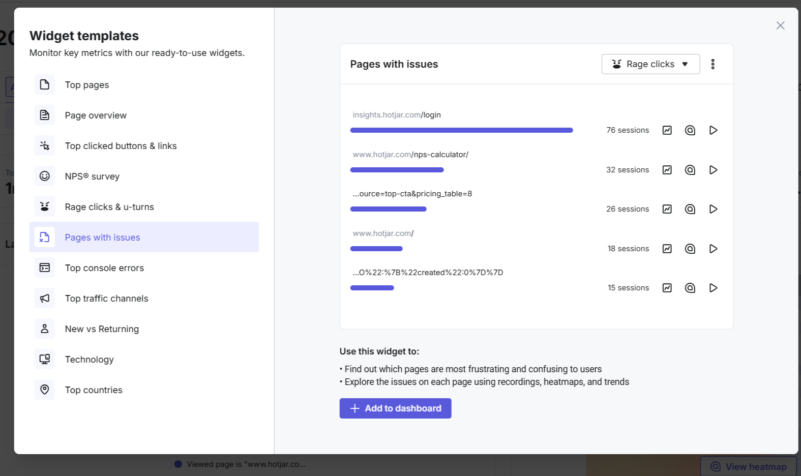
Examples of widget descriptions with contextual cross-tool nudges
The result:
After launching widget templates, dashboard engagement grew significantly—jumping 70% in just one quarter (from 10% to 17%).
This success was supported by several enhancements we introduced alongside templates, including the ability to rename, duplicate, or delete widgets, auto-saving, and the ongoing release of new widgets.
For me, the biggest takeaway was how much impact the right terminology and clear guidance can have. By choosing names that reflected how users actually think, we not only made dashboards easier to use, but also built more trust with our customers.
Phase 2: Dashboard templates
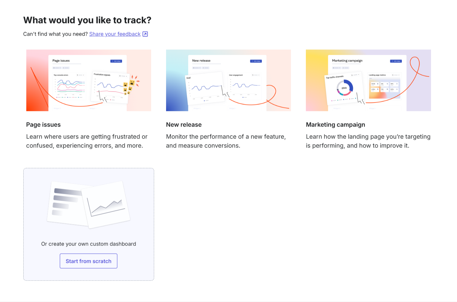
Dashboard templates allow users to generate a dashboard tailored to a specific goal in just a few clicks
Step 2: Provide details
After selecting a template, users need to enter some basic information in order for us to generate a tailored dashboard.
For example, in the New release template, users define a starting event (e.g. Clicked element), an end goal (e.g. Conversion point), and name their dashboard.
Designing this step was particularly challenging. We wanted the setup questions to feel simple and approachable, not technical or intimidating. My approach was to first write the flow as a conversation, which then shaped the final design direction and made the interaction feel more natural.
The completed dashboard with all relevant widgets
I also created all the content explaining what each widget does and how it can help users with their analysis. While this guidance doesn’t take central place within the UI, it helps less analytics-savvy users feel confident choosing the best template for their case.
Another angle to this was increasing cross-tool adoption so this was something we incorporated into the copy and added contextual links to related tools: e.g. ‘‘Dig deeper into each page insight using recordings and heatmaps’’.
Step 1: Select goal
This project was part of a broader Hotjar initiative which involved helping users to tailor features to their jobs-to-be-done or goal.
I had already worked on a similar flow for Hotjar’s Heatmaps, where we introduced goal-driven templates. Following that successful launch, we decided to apply this approach to Dashboards too.
The hypothesis was that offering jobs-to-be-done driven templates will help more users create a dashboard that is relevant to their needs, discover insights faster, and return to use the tool again.
To define the template use cases, we built on a recent in-depth research study into users’ jobs-to-be-done with analytics tools.
The final set of templates reflected three common goals: tracking issues on a page, monitoring the performance of a new release, and analyzing a marketing campaign.

Setup screen for the New release template
Step 3: Your dashboard is ready!
As soon as users proivde all the relevant details and hit ‘‘Create dashboard’’, they’re immediately presented with a tailored dashboard filled with widgets aligned to their chosen goal.
We went through multiple iterations, testing each version with existing Hotjar users and refining based on their feedback. To validate the final flow, we ran an unmoderated study with new users. The positive feedback on clarity, ease of use, and relevancy gave us the confidence to launch Dashboard templates.
The result:
As a result of the improvements, Dashboards became the most viewed tool for weekly active users, showing the value of simplifying setup and aligning with user goals.
This project reinforced how content design isn’t just about microcopy. It’s about making analytical tools feel approachable and useful, even for users who aren’t data experts.