KUDO video platform: Improving how participants join meetings
The context:
I joined KUDO, a platform that provides live speech translation and captions for online meetings, as their very first Content Designer.
Joining an online meeting should be simple but for many KUDO participants, especially those who were new or less tech-savvy, it wasn’t.
The focus of this project was to make the join flow easier and more intuitive. It was a highly collaborative effort where, together with the UI Designer and Product Owner, we redesigned the experience to better serve not only participants but also the interpreters working behind the scenes, who make the platform so valuable and unique.
The team:
Product owner, UI designer, Content designer/Researcher (me). Consulted - KUDO language interpreters
Phase 1: Finding the gaps
We began by running sessions with the Customer Success team to uncover the most common onboarding issues reported by clients. This helped us identify the user groups struggling the most: first-time and less tech-savvy participants.
The majority of the reported issues were caused by poor usability which we knew could be solved by improving the UX, UI and content across this journey.
We also spoke with KUDO’s interpreters to understand how participants’ behavior impacted their work. Live simultaneous interpretation is demanding and requires deep focus. Yet many participants joined meetings without a headset or external mic, making it hard for interpreters to hear clearly. This directly affected the quality of interpretation.
As the Content designer, I saw an opportunity to educate participants through clear messaging that set them up for success while also supporting interpreters’ needs.
Once we had gathered the feedback, we prioritized all the issues based on the number of clients they were reported by. Then it was on to redesigning the experience.
Phase 2: Redesigning the journey
Below are the finalized designs we created, along with the approach and reasoning behind each step in the flow:
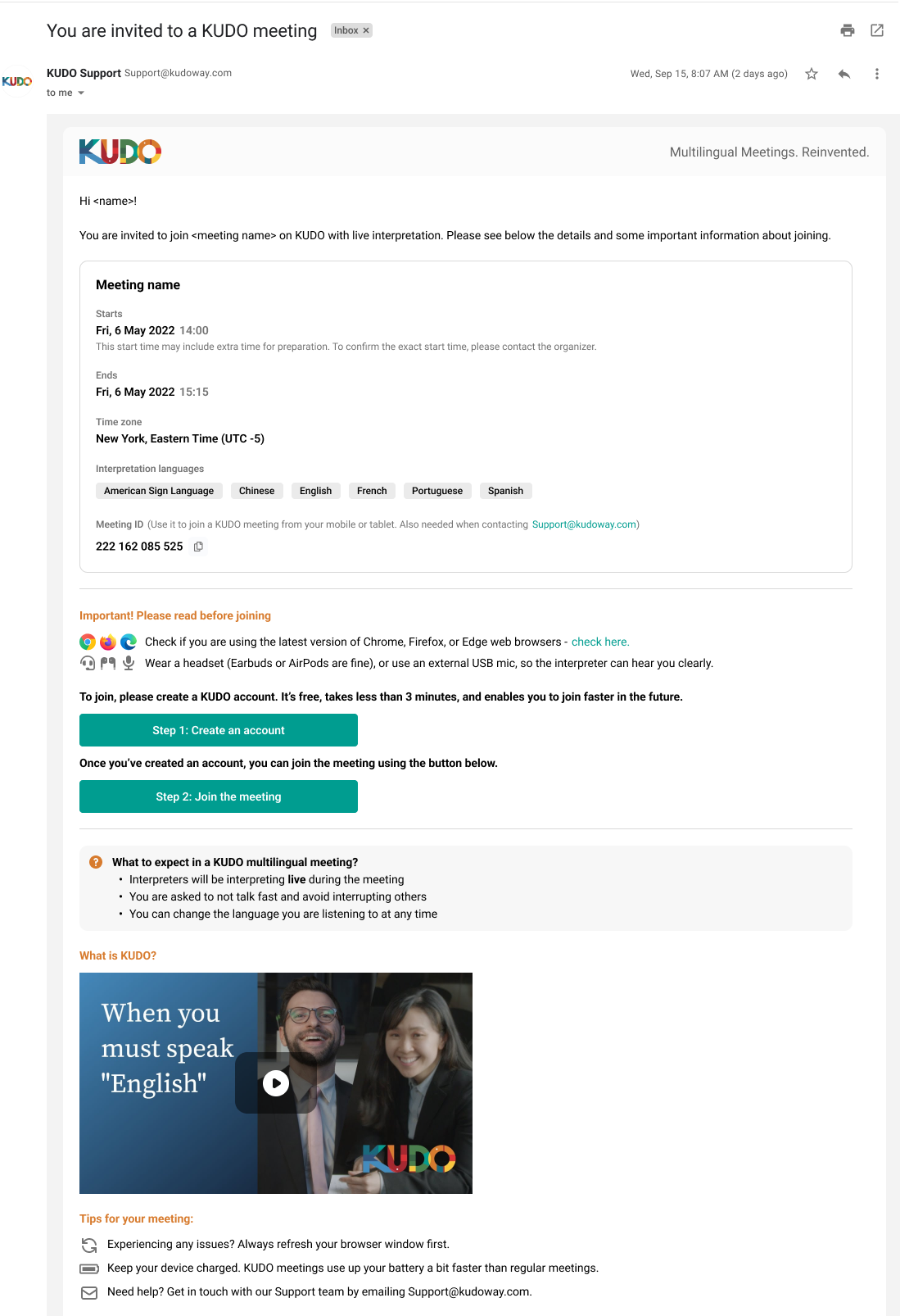
On the left is the email invite sent to participants who don’t yet have a KUDO account.
The only difference from the first one is that here we prompt the user to create an account before joining the meeting.
Up until this redesign project, participants were asked to create an account only after clicking the Join button, which could be quite stressful if done at the last minute.
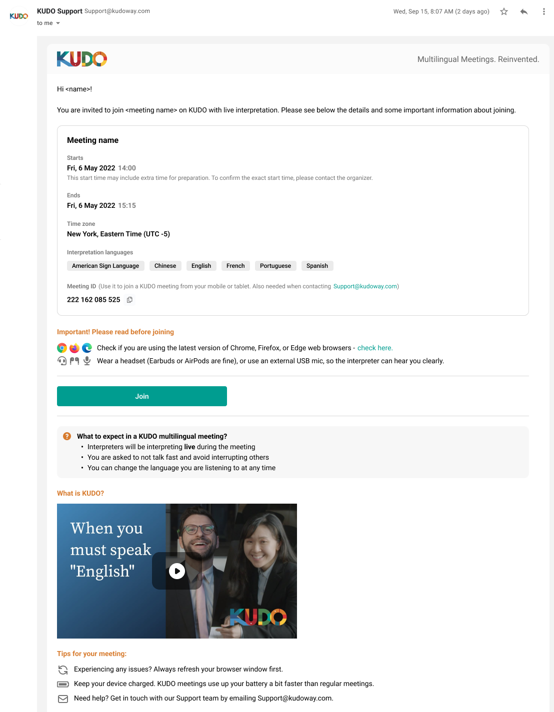
Step 1 - Email invitation
This is the email invitation participants who already have a KUDO account would receive.
The purpose of it is not only to make joining easy but also to ensure participants were properly prepared for a meeting with live interpretation.
Before the redesign, the email had poor hierarchy and there was key information missing. Important details were buried, and the “Join” button appeared before critical preparation information, making it easy for users to miss what mattered most.
To improve clarity and set participants up for success, we introduced:
An “Important” section highlighting essential prep steps, such as using the right equipment and browser. This not only improved the participant experience but directly supported interpreters’ ability to do their work effectively.
A “What to expect” section to guide first-time participants through how a KUDO meeting with live interpretation works, supported by a short explainer video.
A “Help” section with extra tips for troubleshooting and preparation.
This ensured participants arrived better prepared, while also reducing friction for interpreters.
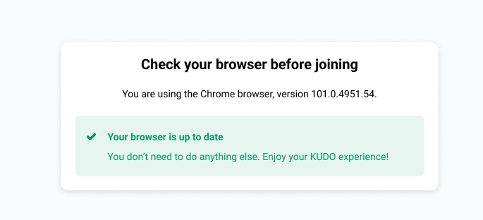
Step 2 - Browser check
This is a new step we created to address a long-standing issue our participants have been experiencing. They would join KUDO meetings using browsers that are either not supported or not up to date, which resulted in a poor meeting experience.
To prevent this, we added a link in the invitation email (Step 1) prompting participants to check their browser before joining.
Participants now see three possible outcomes when checking their browser (see screenshots), helping them take the right action before the meeting starts.


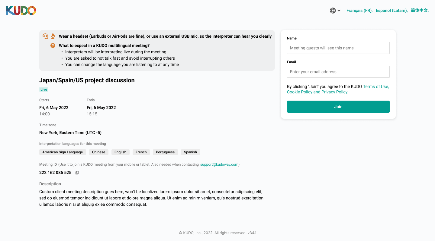
Step 3 - Join screen (happy path)
This is the page participants see after clicking the Join button in the email invitation (Step 1).
This “happy path” assumes the participant has already completed the browser check (Step 2) and is ready to join the meeting.
The content here is very similar to the email invitation. We included a reminder on the most important preparation steps, in case the participant didn’t read the email.
Join screen - edge case
This scenario occurs when a participant hasn’t completed the browser check (Step 2) and now needs to switch to a supported browser to join the meeting.
Since many participants are less tech-savvy, we included clear instructions on how to make the change.
While preventing users from continuing until they switch browsers might seem strict, it ensures they have the best possible experience once they join the meeting.

Join screen - localization selector
KUDO’s mission is to remove language barriers in virtual meetings, so it’s essential that every participant has a smooth experience, no matter what language they speak.
Below is the modal participants see when interacting with the globe icon or the language options at the top of the Join screen (from the previous step).
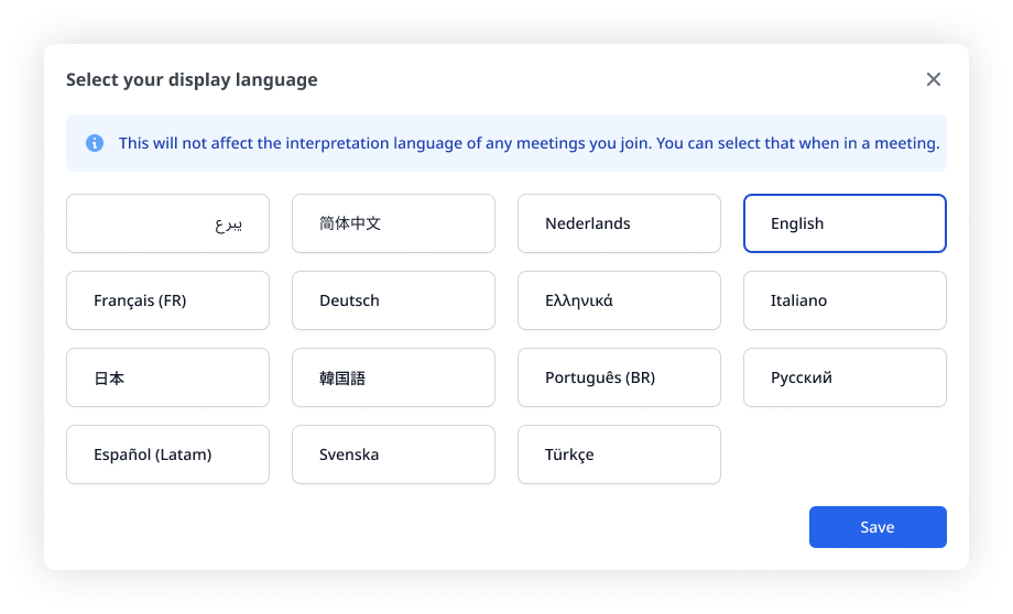
The copy for this modal needed to address a common point of confusion: participants often misunderstood that the display language is not the same as the interpretation language, which they can select only after joining a KUDO meeting.
When working on the content, I wasn’t sure if the term “display language” would be clear or too technical. I had prepared five or so versions to test during usability sessions (more on that later). Fortunately, most participants understood “display language” best, so we moved forward with it.
For this screen, we collaborated closely with the Localization Manager to determine the best way to present the language options, and the optimal entry points for the modal.
Step 4 - Waiting room screen
This is the final screen participants see before they join a meeting.
Here, they can set up their microphone and camera, test their connection, and check their speakers.
We also use this screen to explain the type of meeting. For example, in this case, a Request to Speak meeting, and clarify what that means for the participant.

Waiting room screen - mic and camera browser request modals
These modals prompt participants to enable their microphone and camera before the meeting begins. A confirmation modal also appears if a participant chooses to block access.
During usability research, we learned that some participants were hesitant to allow access due to privacy concerns.
To address this, I wanted the content to clearly explain why access is required and emphasizes that it’s a browser, not platform, requirement, helping to build trust and reduce anxiety.

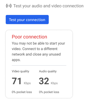
Waiting room screen - connection test
Participants are also given the option to test the quality of their audio and video connection to ensure it’s strong enough for an optimal meeting experience.
We collaborated with the Engineering team to design a simple way to communicate connectivity quality, ultimately deciding on three clear ratings: Excellent, Good, and Poor where each indicates what it means for the meeting experience.


Step 5 - Meeting room
This is the screen participants see after joining a KUDO meeting. We wanted to provide guidance for first-time users or those who haven’t used the platform in a while.
We introduced tips highlighting key interface elements unique to a platform offering live simultaneous interpretation.
The most important tip is for the interpretation language selector. Since KUDO provides interpretation for both sign and spoken languages, I wanted to ensure the content within the tip is as inclusive as possible. This is why it’s worded as ‘‘Select the language you want to listen to or see the interpretation in’’.
When participants open the selector, bullet points clarify some common misconceptions we heard about when doing the initial research. For example, that there’s no need to select the language they’re speaking in.


The second tip guides participants who are unfamiliar with the Request to Speak functionality. This type of meeting is common in parliamentary procedures and court sessions, where participants must wait for permission to speak.
Through a series of short, easy-to-follow tips, we explain the process: click the “Request to Speak” button, see the “Request sent, please wait…” confirmation, monitor the number of people ahead in the queue, get notified when your request is accepted, and finally indicate when you’ve finished speaking.


Phase 3: Research and implementation
User interviews: Usability research wasn’t initially factored into the plan for this redesign. This was mainly due to the company’s UX maturity and the absence of a dedicated researcher. However, with a flow with this many screens, our team knew it’s crucial that we test before shipping. The Product Owner was able to extend the deadline by a week, giving us time to conduct interviews and implement improvements.
Leveraging my previous experience as a researcher, I created objectives, wrote the testing script, recruited participants, and conducted interviews with six users.
We asked them to complete a series of tasks using our prototype.
Insights: After the interviews, we used a FigJam board to record all of our findings, and do an affinity mapping exercise.
Workshop: I facilitated a session with the Product Owner, UI Designer, and Localization Manager to group all of our findings and define actionable next steps.
We then applied the research insights to design the final iteration of the journey—the one you’ve just read about.
The result
Following the redesign, we received excellent feedback from customers. The number of issues, complains, and questions reported to the Customer Success team also decreased.
We planned for further iterations in collaboration with the Marketing team, involving video content and animation within the invite emails to make them even more engaging and helpful.
For me, the biggest win was establishing a process that involves usability research and iteration, and can be applied to other redesign projects. This approach not only improved the participant and interpreters experience but also demonstrated to leadership, including the CEO, the value of investing in research.