Revamping Contentsquare’s navigation: Improving Information architecture and UI
The context:
What started out as a navigation redesign project evolved into laying the foundations for a navigation that’s robust and scalable enough to house the needs of 3 different platforms.
For me, as a Content Designer, this was an opportunity to work at the most strategic level of my craft — shaping the information architecture, naming conventions, and grouping logic that make the product understandable.
The team:
Product manager, Product designer, Content designer (me), Product leads, Marketing, and Leadership.
Phase 1: Categorizing navigation concepts
The challenge:
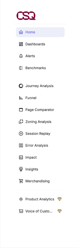
When I joined the team, Contentsquare’s navigation had just gone through a redesign. It had shifted from a top bar, where three main categories grouped all features, to a sidebar that exposed the platform’s full feature set. This change had a positive impact, significantly improving the visibility of features that previously required one or two clicks to access.
However, there were still deeper issues with usability and scalability, and in some cases, they had become more pronounced:
Complexity: Users were still overwhelmed by the platform’s complexity. New features were continuously added without a clear strategy, resulting in a navigation that felt cluttered and misaligned with users’ mental models.
Lack of guidance: Onboarding could take up to six months and required extensive setup. With 70% of our users being new joiners, the absence of in-product guidance created a major barrier to successful adoption.
Unintuitive jargon: Some entry point names used internal terminology rather than industry-standard or user-friendly language, making it harder for users to understand what to expect.
Scalability challenges: Teams were continuously adding new features to the primary nav, as everyone wanted that visibility, which meant that we were running the risk of ending up with scrollable navigation.
Lack of internal alignment: There was no shared understanding across teams of what navigation was meant to achieve—was it for upsell and cross-sell, onboarding, or education? There was also no clarity on how the information architecture should be structured: by user role, plan, product object, goal, or mental model?
We also knew that we need to build a navigation that can work for the needs and audiences of two other platforms Contentsquare had acquired—Hotjar and Heap. They had their own navigation issues so we needed to come up with a solution that would align and unify the platforms.
The goal:
We set out to address all of the above issues and increase adoption of the platform’s features within the primary navigation. At the time, most customers were only using one or two, with very low engagement during their first month of joining.
Our goal was to make the platform easier to use by simplifying flows between the different features, helping customers reach that "aha moment" faster. This would also helps us to increase adoption and retention, and reduce churn.
Additionally, we were facing some internal challenges we needed to solve: the platform offered 32 different packages, each requiring slight navigation adjustments, there was little visibility into the navigation needs of different teams; and we lacked a scalable framework to manage it all.
The process:
I suggested to the PM and Product Designer that we start by understanding how our customers think about concepts and features—not just within our platform, but across the analytics space in general. This aligned well with an idea we wanted to explore which was grouped navigation, where group names reflect users’ mental models and goals when using the platform.
A card sorting exercise felt like the best first step. We asked participants to create categories out of a mix of objects (inspired by the OOUX design methodology) along with our existing features from the menu (e.g. Funnel, Zoning Analysis, etc.) Our participant pool included internal stakeholders (mainly from the Customer Success team, who had deep insight into customer behavior), and existing customers. All sessions were moderated so we could better understand the reasoning behind their groupings and the labels they chose.
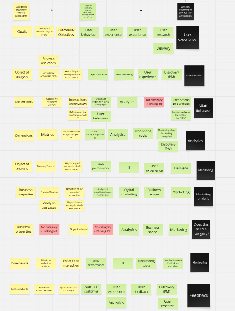
The PM and I then analyzed the insights and, based on the suggested group names, came up with an initial proposal for how our navigation could be organized.
Analyzing the card sort results and creating groupings based on the feedback
As we progressed, we began having conversations with leadership about the broader purpose of our navigation. It quickly became clear that there was no shared understanding or unified vision guiding how we were using it.
Was the navigation purely there to help customers find their way around?
Should it also educate them on how to use the platform effectively?
Or promote new features they hadn’t yet discovered—or purchased?
Or… all of the above?
At the same time, more and more teams were releasing new features they wanted to add to the main navigation to boost visibility and adoption. But we knew that adding everything would only overwhelm users and reduce clarity. It was clear we needed a navigation strategy, a set of guiding principles, and more visibility of upcoming feature releases that directly impacted the navigation.
Creating visibility:
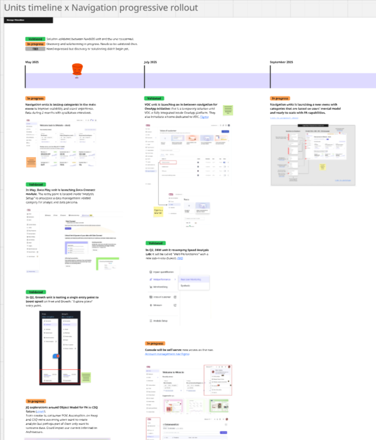
To tackle the lack of visibility around upcoming navigation needs, we set up a shared Miro board and invited all teams to contribute. The goal was simple: give everyone a space to share what they were working on and how, and when, it might impact the navigation.
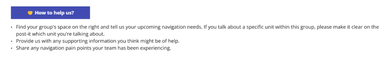
Snippets of the Miro board aimed at creating visibility of teams’ navigation needs

Over the course of a few weeks, we collected input from across the org. A few upcoming projects we weren’t aware of that directly impacted navigation came up. This early visibility gave us the chance to support those teams in figuring out where their new features would best fit within the platform’s information architecture.
We decided to keep the Miro board as a living, ongoing source of truth for navigation planning—somewhere teams could continue to log upcoming needs as they emerged.
Using the input we gathered, we built out a navigation timeline that looked almost a year ahead. It mapped out upcoming additions to the nav, new feature releases, and planned iterations of the redesign—giving everyone a clear view of what was coming.
Of course, it wasn’t set in stone, but it helped us, and the rest of the company, see just how dynamic and evolving the navigation really is.
Creating a strategy:
Meanwhile, I started putting together the foundation of the navigation strategy deck that was going to be the blueprint for how navigation should evolve going forward. The goal was to develop this alongside a clear set of guidelines that other teams could follow, reducing the need for our team of three to be involved in every single navigation-related decision (which just wasn’t scalable).
I started by outlining the three layers of navigation, introducing the concept of information architecture, and explaining why it matters. This felt essential, as not everyone across the business shared the same level of understanding or maturity on the topic.

Part of a slide on information architecture and why it matters in the context of navigation
Next, I captured the current challenges we were facing—many of which are detailed earlier in this case study—using both qualitative and quantitative insights we’d gathered over the past few months. I presented the nav challenges across the three platforms which helped us realize that while the audiences were very different, the pain poitns were in fact, quite similar.
Then came the mission and strategy itself. We wrote a mission statement that captured what we believed navigation should enable: a scalable structure, intuitive user journeys, goal-driven experiences, and seamless data integration.
To inform this, we summarized our personas, key user needs, competitor analysis, and our own convictions as a team about what would serve our customers best. Here, we also compared and contrasted the three platforms that would rely on this new navigation, ensuring the strategy could support all of them.
We also defined a long-term vision, including clear criteria for what belongs in the primary, secondary, and tertiary navigation. To help drive alignment, especially with leadeship, we included a list of what to avoid in primary navigation. For example:
❌ Don’t use primary navigation to teach customers how the platform works
❌ Don’t use it to promote new features
❌ Don’t use it to reflect the internal org structure
The goal was to bring clarity and consistency to how we approach navigation—and to make sure everyone was pulling in the same direction.
Creating new navigation proposals:
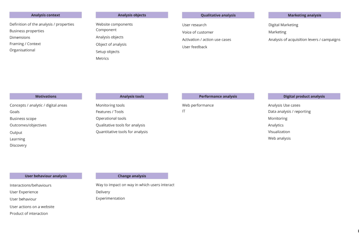
As part of creating this strategy deck, we revisited the card sorting insights, and began mapping out what a grouped navigation could look like, keeping our principles in mind. We factored in the needs of the two acquired platforms, along with upcoming feature releases identified during our alignment exercise. The group names were directly informed by the card sorting results, and aligned with industry standards.

On the left is an exploration we came up with as we were working on the final proposal. It addressed several of the challenges outlined earlier:
Minimal UI changes, focusing mainly on categories to reduce disruption for customers
Significantly reduced length of the side navigation
Groups the multiple features we have by how they’re intended to be used, promoting the use of several of them to get a job done
Scalable and future-proof structure
Group names based on users’ mental models rather than internal jargon and biases
A single upsell entry point, keeeping upgrade opportunities visible without letting them dominate the navigation.
The result:
Our team recommended running a Beta test of the grouped navigation with a select group of customers to validate our vision and assumptions. Unfortunately, the test didn’t get the green light as other, more urgent priorities came up.
Even so, I still consider this project a particularly valuable and successful experience. It gave me the opportunity to contribute to a truly strategic, high-impact initiative, and achieve meaningful outcomes along the way. It also reflects what I believe content design should be: not just crafting words, but shaping the structure, clarity, and logic of the product so that it’s intuitive to use.
Together with my team, I was able to:
Build alignment and transparency across teams
Start the conversation about putting information architecture at the core of our product strategy
Develop a navigation strategy deck with the potential to shape the entire organization, and unify three platforms
Work closer to leadership, gaining firsthand experience in balancing business objectives with user needs.